Thursday, 8 December 2011

Influential Posters that caught my eyeeyeeye


Kidulthood was an influence for my trailer so researching the posters for this very successful movie gave me some initial ideas for my trailer poster, as explained in another post.


Similarly to Kidulthood, the sequal; Adulthood was another influence for the ideas i conducted for my trailer. Different features of their posters as shown above influenced me for my poster ideas, such as the character placement, the title placement and effect etc.


The character placement in the posters for Anuvahood caught my attention, the contrast between the two characters in the foreground compared to the several other characters in the back. The slang used in the caption above the title in the landscape version of the poster really relates to the film and gives a slight suggestion to the plot, although the effect of having slang used was apropriate for Adam Deacon's movie poster, the caption I would need to include wouldn't suit having this type of caption, however, the fact that their catch phrase isn't very general and represents their film influenced me.


The film poster for Megan Fox's film Jennifer's body influenced me slightly as it includes the element of appealing to the male gaze. This effect is when the female character of a film is presented in a sexual way when advertising, so in this case Megan Fox (known for being an attractive actress) is dressed in what can be assossiated with an attractive costume, this will appeal to male audiences. However her body language and make-up make apparent to audiences the genre of the film. As my trailer included a slight element of thriller, a poster like this with my main character influenced me, however I think that it would be more effective if I was to use something similar to this for my magazine cover.

The posters above and below influenced me for ideas towards the construction of my poster as they both have close-up, more so in the poster below for Prom Night, however the top poster advertising the film Cry-Wolf, includes a weapon suggestively used in the film. In my trailer there are short clips showing a pair of scissors, suggesting this is the weapon of my movie The Imperfect. Cry Wolf influenced my idea of including the scissors in my poster, as well as the mask I used when filming my trailer. The simplicity of these posters also caught my eye when competing with the busy aspect of having several characters included on the poster. I think that the simple look of these two posters make the effect of the poster much stronger and yet still portray the genre and an insight to the plot with very little imagery used, however the material shown is edited well to portray the film further.


The Donkey Punch movie poster has the element of "half and half" which I initially wanted, to create my poster. However involving the elements of Kidulthood, Adulthood and Anuvahood, this poster also includes all the characters, it shows the two sides of the film, the party life style thats portrayed at the start of the film and the horror/thriller aspect that the plot spirals into, similarly to mine. 


This other version of the Donkey punch poster really caught my eye as it not to subtly gives away several aspects fo the film, however this one object allows freedom for the audience to interpret the potential plot of the movie, this influenced me because the simple detail shown could appeal to my movie as I could do a similar type of poster with the scissors used in my trailer, or the mask that is briefly shown.


Tuesday, 6 December 2011

Initial Poster Ideararars

My First Poster Idea.


The first idea that came to mind when creating a poster for my trailer was to have a similar image of the main character, Jessica - played by Melina John, mirrored vertically. The images would be very similar in terms of position, the mirrored pictures would be placed symmetrically, however the difference, initially, was to have one of the images of the character looking "perfect" with her make-up done without fault, her hair to be straight and un-messed, and to be smiling etc. like the rough sketch below. What I want is to have these images faded into the background of my poster, and have the other characters and another image of Jessica, in focus, in the foreground


This image as shown in the overall sketch above, would be the reflection. This fits with the idea that I wanted the main female character to suffer from Bi-polar schizophrenia, similar to how I represented my Pitch idea, having the three images opening out to show the three different personalities that she has. This would resemble her journey to becoming obsessed.

My idea consisted of having the pictre to the right placed at the top of my poster, the right way up and nont flipped horizontally like the sketch above. Both of these pictures would have to be edited in opacity, to make them fade into the background of the poster to fulfill the overall intention that I want to pursue.


This sketch resembles the title placement idea that I grew fond to. Over the eyes of the images I sketced above, I thought that it could be interesting to place the title over the eyes. At the begining I had the idea of calling my movie "Nobody's Perfect", with this in mind, the reflection technique above would have "Nobody's" over the eyes of the sketch that shows Jessica's character messy, and "Perfect" over the eyes of the reflection of Jessica's character that is shown to be looking perfect. This would mean that one of the titles were upside down, but taking into consideration the size of the font I would use, I do not think that this would cause an issue.


Similar to my influencial posters, Anuvahood; Kidulthood and Adulthood, and how they show all of the characters from their films, I drew another idea for a poster which consisted of all of the characters, individually shown, portraying different aspects of the film. Above is a rough sketch, the male characters on one side, and the females on the right. I purposely placed the two other "main character" other than Jessica at the front of the cluster of extra characters.


I was influenced by Anuvahood's idea of having two characters in the forground, however I wanted to portray my intitial idea of a love triangle by having Dominic and Robyn in the forground and Jessica in the middle, even though this sketch doesn't show her character this shows the placement of which I wanted to have the two characters if they were going to be on the poster, however i decided against it.


When advised by my tutor I was told that it may be a better idea, in keeping with the eye effect that I explained previously, to make the half and half reflection vertically mirrored.


Poster Ideas

The following posters are from several films that have influenced my ideas for my trailer project. Because these films were so successful in attracting teenage audience members, I thought about analysing the different aspects they include in their posters. As you can see below, each film has different posters however they are very similar in design. During my research I found that 'Anuvahood', 'Kidulthood' and 'Adulthood' all have a portrait poster and a landscape poster. I took these layouts into consideration throughout the construction of my poster, what appealed to me was the portrait style of poster.

ANUVAHOOD

Portrait Anuvahood


Landscape Anuvahood


What appealed to you about these posters?
  • Whilst I was creating ideas for my poster and prior to that, when my attention was caught by all of these film posters, I appreciated the idea that all of the "main" characters are present on each of the posters. For Anuvahood the two main characters, are more in the foreground and the majority of the rest of the cast are in the background but also contribute to the effect of the poster. This layout already shows an element of the story without giving too much detail away. That there is tension between the two characters. Similarly with the Kidult and Adulthood posters, all of the main characters, to which the film follows their stories individually and collectively, are visable on the poster. These two movies however, differently to Anuvahood, have all of the characters in similar proportion to eachother. Their cotumes and position on the poster enable the audience to predict what each character is like.


KIDULTHOOD


Portrait Kidulthood

Landscape Kidulthood


  • The titles used on these posters also caught my attention. With the posters for Adam Deacon's - Anuvahood, the main title is influenced by the buildings edited cartoon-like in the back ground of the poster. For the portrait poster, the editing of the title, has the name parted into 2 letters going vertically downwards between the "buildings", however for the landscape version of Anuvahood's poster, the lettering placement adjusts in height as the buildings vary in size. This playful title editing interested me towards this film, but I did not feel it was appropriate for my movie trailer. As for Kidulthood, how the title is placed in the portrait poster reminds me of the stickers or grafitti found in the streets of london, where this film was shot and the poster is in keepinng with that, because it is at a slant as well as the credits this also portrays what the film and the characters are like. All of the three films have very contrasting colours in their posters, this is successfully used as the titles are all very eye catching and clear to make it easier to attract their audience members. Adulthood has bravely put their star ratings and film comments in a similar size font to their title name, however this does nont distract from the film name as the colours have been well considered.
ADULTHOOD

Portrait Adulthood


Landscape Adulthood


  • The subtle photoshopping techniques all of these posters have also interested me. In all 6 of these posters, the entire image wasn't taken as a whole, the character photo's were individually taken, the backgrounds are edited in, (Anuvahood's background could have been created on a cartoon animated/ comic-look effect programme) and then constructively merged together, overlapping to create a realistic and believable poster. Many things have been considered when doing so, the lighting and shadinng produced on each of the characters would have to be monitored to make the all together photo more realistic, as well as the proportion of each character in relation to another. However in referrence to my poster and magazine cover, I think the ideas I have created in result to these posters and in being influenced by these aspects, I feel it is more suitable for my magazine cover.

Thursday, 1 December 2011

Poster Credits


DISTORTED TASTE ENTERTAINMENT presents


a DARK HEART PRODUCTIONS film "THE IMPERFECT" MELINA JOHN SIMON MURPHY starring CHLOE BYERLY TYRA JOHN DANIEL BALAAM RACHEL KEMPTHORN EMILY FRASER MEGAN CUNNINGHAM WILLIAM JAMES BENNETT


costume designer SOPHIE ROGERS music by SCOTTY STACKS with THE MANOR edited by MELINA JOHN production designer RITA STEVENS director of photography REGINALD GASTON executive producer MATHEW BOOTHE directed by MELINA JOHN


THE IMPERFECT characters, names and related indicia are trademarks of and (c) Distorted Taste Entertainment Inc. The Imperfect Publishing rights (c) Melina John. The Imperfect (c) 2012.


Wednesday, 30 November 2011

Task de la Poster

Poster - Due 2nd December
  • Worth 10% of total mark
  • Must act as an extension of teaser trailer
  • Characters from trailer on poster
  • Artistically fits your poster
  • Must admire the regulations of film posters
This includes the name of the film title, actors names, film credits, a release date, a caption that is appropriate for the film.
  • Awareness of conventions of layout and page design
  • Awareness of font and text size variety
  • Appropriate use of language
  • Appropriate use of ICT
  • Framing shots, distance, variety
  • Must use own imagery
  • Think of a slogan
  • Tital takes priority
  • Blog must continue to track production, design and construction of poster
  • Influences: unique designs, posters of teaser trailers
  • Confirm target audience, how they will be targeted by your poster.

Poster sizes

  • Quad, 30 inches - 40 inches (Landscape)
  • Double crown, 20 inches - 30 inches (Portrait)
  • One sheet, 27 inches - 40 inches (Portrait)

TERMINOLOGY
  • Tagline: catchy, short phrases used by marketers to advertise and sell the movie.
"Don't obsess with your imperfections"
  • Credits: Name of cast and crew at the bottom
  • Title: Big lettering
"The Imperfect"
  • Release date
  • Star credits: Often above or below title in bigger font than other credits.
"Melina John,, Simon Murphy"

Tuesday, 22 November 2011

Logo ideas and problems.


The images above were my initial idea for an animated logo for the production company I had created called Traffic Light Production. This idea was terminated after I was advised that the imagery created may suggest and glamourise the idea of smoking. I was going to have the title/production name appear in the smoke, and took several photo's to make a flip book looking effect making the images seem to be moving.


The above and below images show a drawing of another idea I had for a logo of a company supporting my film. Dark Heart Productions. I initially wanted this to be animated in the sense that the lines surrounding the robot were representing a zooming motion. I would create this full effect using photoshop combined with iMovie HD.


Distorted Taste Films.

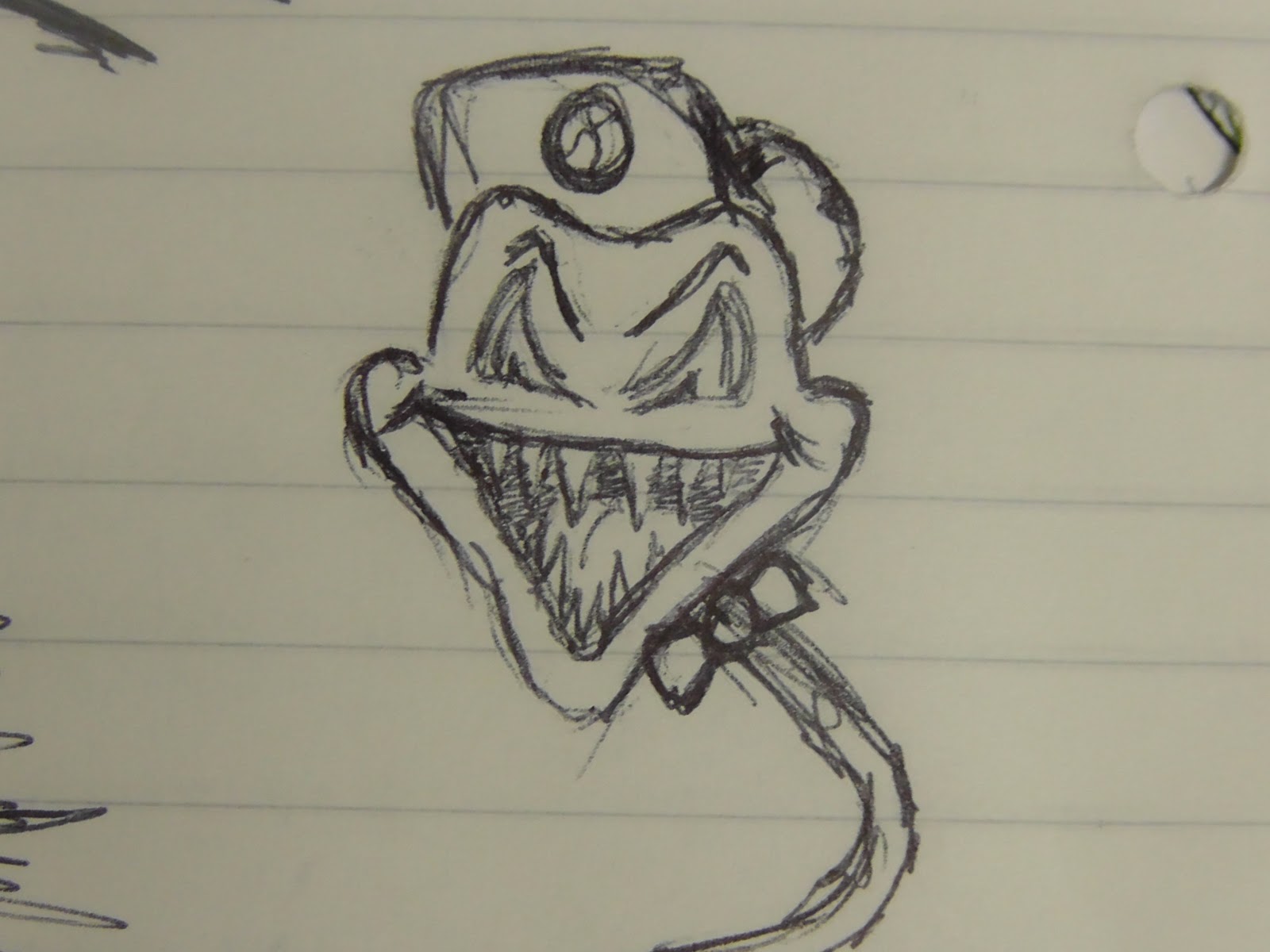
This image above shows another logo idea I had created with interest of it becoming an animation also, however being more confident sketching and drawing my ideas for several aspects of my project I would have found some of my ideas difficult to complete. For instance I wanted this sketch showing my initial idea for "Distorted Taste Films" to animate by having the neck wave like a slithering motion of a snake, however with the time and technology available I felt it suitable to pass on that idea.

Friday, 18 November 2011

Testing.Testing.

I wanted to create the effect of the main female character, Jessica, writing on the lens of the camera. To successfully fulfil this effect, I thought of several pieces of material that I could possibly use to write on and that still maintain a realistic look to it. When attempting this task with a clear plastic sheet, curvatures in the sheet were visible from the light reflecting off of it, a similar problem with a glass window as you can see in the first image below. Using a glass window to write on proved more successful than the sheet.