Tuesday, 13 December 2011

Photography: The Eye

The following pictures of this mise-en-scene was taken for the purpose of creating the poster and/or the magazine cover for my movie trailer; The Iperfect. The objects position played an important aspect when taking photographs. Below are a variety of different shots taken in consideration of the position, lighting and the shot frame/distance from the camera.


Creating the effect


Photo behind the mask


Photography: The Scissors

The following pictures of this mise-en-scene was taken for the purpose of creating the poster and/or the magazine cover for my movie trailer; The Iperfect. The objects position played an important aspect when taking photographs. Below are a variety of different shots taken in consideration of the position, lighting and the shot frame/distance from the camera.

Scissors No.1


Scissors No.2


Photography: The Mask

The following pictures of this mise-en-scene was taken for the purpose of creating the poster and/or the magazine cover for my movie trailer; The Iperfect. The objects position played an important aspect when taking photographs. Below are a variety of different shots taken in consideration of the position, lighting and the shot frame/distance from the camera.


Mask In The Light


Magazine movies

The following clips show the different stages I went through to create an idea for my magazine cover. It shows the different layers and different elements I have included from the magazine covers of Little White Lies, including the Little White Lies title. Different images and sketches I have created are merged together and give a rough idea of how my final product will look.


Combination of my drawings.


The screen movies I have included in another post show the process I went through to get to this stage in the making of my magazine cover. This screen grab shows the overall image I am going to use to produce my version of a Little White Lies film magazine issue.

Friday, 9 December 2011

Little White Lies Magazine Company

Little White Lies is a bi-monthly magazine that features writing, illustration and photography related to cinema. 


Little White Lies is an independent film magazine produced by The Church of London.

The first issue was released in February 2005, printed in edition of 2500, and distributed only in UK Borders stores.


In 2008, Little White Lies won its first major award: Best Designed Consumer Magazine of the Year at the Magazine Design & Journalism Awards. 


Its website, littlewhitelies.co.uk, was launched in 2006.  


The design of each issue of Little White Lies is inspired by its feature film, represented on the cover by an illustration of its lead actor.


The cover film also influences interior aspects, such as editorial icons, chapter headings and custom typefaces.


However, the overall template of the magazine remains the same.


Little White Lies is distributed through over 500 outlets in the UK, including WHSmith, HMV and Fopp


magazine drawings 1


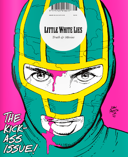
Researching through the variety of film magazine's available for our project, as inspiration or to create a cover in the same style, The Kickass issue above made by the magazine company Little White Lies caught my attention. The cartoon style imagery advertises the film using bold contrasting colouring and a comicbook style look to entise the audience. Most of Little White Lies magazine covers consist of a close up of the head and face of characters in the films the magazine is promoting. The detail is very minimalistic and doesn't include such things as the film release date, actors that are in the film or other magazine aspects for example interviews, however the magazine does include them on the interior of the book but doesn't advertise or inticate the content on the front cover.

I sketched a rough idea of what I aspire to have my magazine cover would look like if I used this idea shown on the Kickass issue. A simplistic facial portrait with little detail and just the Little White Lies company sticker (containing the barcode) and the title of the film.

The Little White Lies company print their name, their magazine caption, the barcode of the producet, the price of the product and its issue number, all in a white circle placed at the top centre of the cover. This usually places in the middle of the character's forehead. I have considered this when designing the initial ideas for my magazine cover promoting my film, The Imperfect.
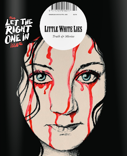
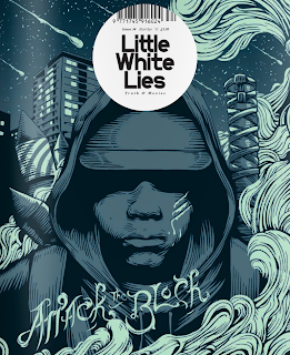


Drawing inspiration from the top two images, as well as maintaining the idea I gained from the Kickass issue of a cartoon style cover, Attack the Block and Let the Right One In drew my attention to the effect of colours and effects. As shown in my sketch below, I have combined elements from both of the magazine covers, from Attack the Block I have used the spirals and flowing strokes of coloured pieces to represent the drug and tripping element of my movie on the cover. From Let the Right One In I have been inspired by the dripping blood across her face, however similar to the ideas I came up with for my trailer poster and the focus on the eye, I placed a drop of blood coming from the portrait of Jessica's character (the main character from my film project The Imperfect). However this is also another rough idea.
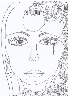


To maintain the idea of the thriller element of my movie, I went through several ideas of how I could include the mask I used for my poster or the scissors that I included in the trailer. Below is my first sketch of how I can contribute to the magazine cover, the element of thriller. By holding the scissors used in my practical but in a subtle way to just suggest to the audience members of the magazine cover. This in combination with the blood drop will be enough to suggest the genre of my film.


To successfully get the right sizing etc. for this sketch I used the computer programme PhotoBooth to take a visual photograph of myself and measure up with the facial portrait sketch I had previously made.

Thursday, 8 December 2011

Photoshopping


These photo's show the stages I went through whilst using the computer programme Photoshop to edit the photo's I had taken to produce my poster.

After taking multiple pictures of my mise-en-scene prop, the mask, getting a variety of shots to show different angles of the mask, moving the mask from a light surrounding to a dark surrounding and working out the best position to get an effective shadow across the surface, I narrowed them down to a few photos to which I began editing.

Firstly I edited the background to be completely black, the background of the picture was of a dark carpet (as I placed the mask on the floor to gain a completely precise picture). To do so I used a selective cropping tool, to go precisely go along the outline of the mask, this was easily done as the contrast between the colours of the background (black carpet) and the object in the foreground (the mack) ranged greatly, this difference was automatically recognised by the programme. Selecting the areas that weren't needed, were then deleted, to leave me with a full black background surrounding the image.