Monday, 30 January 2012

Evaluation question numéro uno

In what ways does your media products use, develop or challenge forms and conventions of real media products?


The following is a youtube link to the video. http://youtu.be/U4YzgIJ4UbE


Below is the Script produced and used in the video.
During the post-production period of my media project, through research and planning I noticed that a common media convention presented and used in movie trailers is a title card placed at the begining of the trailer. This green title card makes the audience aware of the feature's certificate and states the type of audience the feature is suitable for. For these reasons I decided to use this convention of real media by including this specific aspect of movie trailers in my "Imperfect" teaser trailer.


This form of presenting titles etc is also popularly used at the end of trailers containing the names of producers, editors, directors and all involved with the making of the film, I wanted to include this at the end of my trailer to give my project a professional feel to it, and to also mention the names of people who helped, to show my appreciation to them but to also allow the audience to who was involved (which is a main reason of why the media industry also include them) for example the unsigned music artist Scotty Stacks, part of The Manor who's track I used throughout.


Another common convention of real media that offen differentiates between films, genres and trailers is the release date and the style in which it is presented. films can personalise the way in which their trailer expresses the films release date, however there are several forms used such as simply 'coming', 'coming soon', genre's such as teen and romantic comedies offen state the season of year the release date for the film is in; 'in cinemas this autum' or 'summer 2012'. I wanted to develop these simplistic approaches, and in some ways challenge the convention by personalising the statement to help aid the portrayal of my genre.


When taking into account titles for my trailer I was initially influenced by the use of titles in one of my influencial trailers "Anuvahood" starring Adam Deacon. The titles in this movie trailer are based purely on the main character and his life, similar to the film itself, the titles also underlines the main aspects of the film, not giving a clear storyline or narration, however enlightens the audience of what to expect from the characters through simple statements and questions. That idea was soon overpowered by the visual intensity used by the producers of the teaser trailer for the 2011 version of "The Girl With The Dragon Tattoo" starring Daniel Craig. This movie trailer included very little titles having to explain or indicate what the film is about, it simply manipulated multiple clips out of sequence of the film. This also interested me as it doesn't give away the plot to its audiences, intreaging them further.


Having then used titles at the very end of the trailer "The Girl With The Dragon Tattoo" states the film is from the international best-selling trilogy. Even though the minimal use of titles in this trailer was very effective and influenced me to do the same, I regret doing this as I feel my trailer didn't have the same powerful effect, several apsects could have effected this. The use of famous and well known actors. The fact that The Girl With The Dragon Tattoo is a INTERNATIONAL BEST-SELLING NOVEL. I would also need a larger budget to do so.


"the girl with the dragon tattoo" also influenced me in an auditory sense. I developed their use of distorted sounding towards the end of their trailer as the titles are flashing and the imagery is repeatedly shown and enlarging, the music becomes distorted and alternates between being high and low in volume. I developed this idea and used it in my piece, I found myself using the program iMovie and edited the audio to repeat and differ in sound, pitch, tone and length as I also made it sound echoed. I felt that this was effective as I then edited this section of soundtrack over my movie title "The Imperfect" to which I then edited the visual material to also have a slow motion feel.


For my poster main aspects were taken into account through the period of time when I was researching my influencial film trailers and constructing initial ideas. A convention all posters have are credits placed somewhere on the design, commonly placed along the bottom, and always in a very small font in comparison to the title of the film. These credits include a copywrited webpage as well as the names of the production team etc.


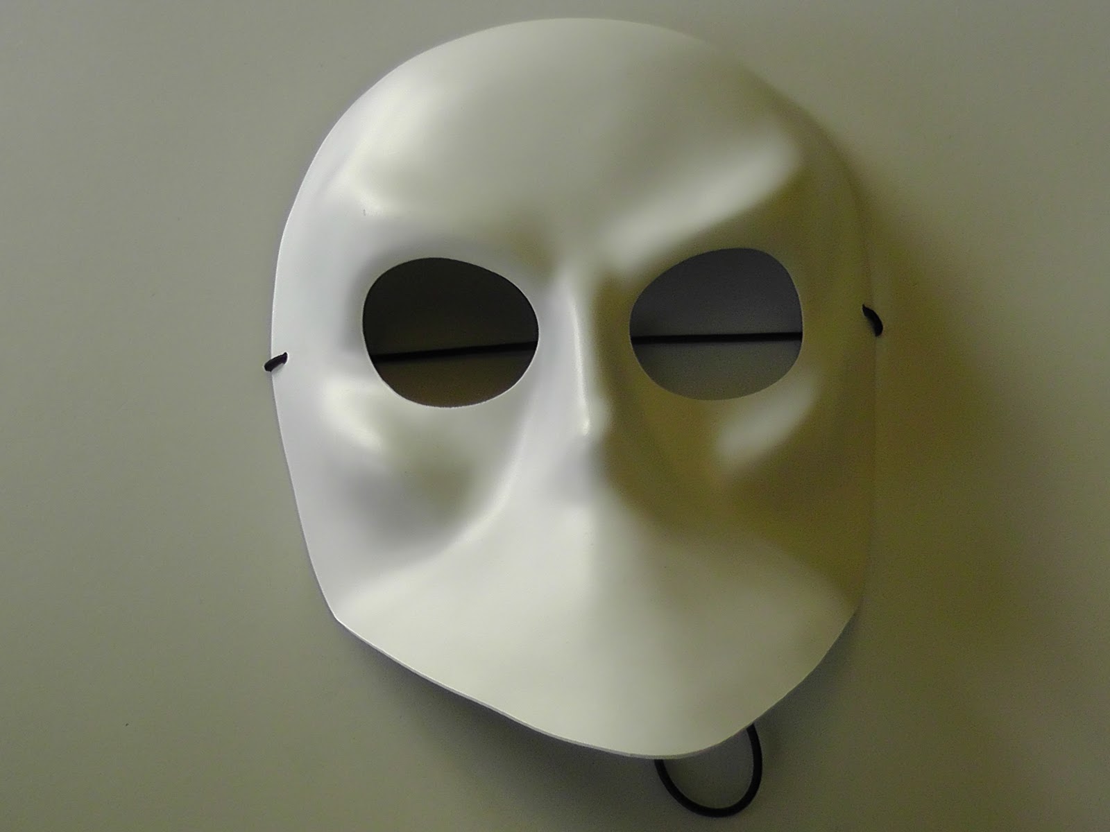
For the final idea of my poster I was influenced by another of my influencial movies "Donkey Punch", who's storyline is similar to mine in the fact that It comes across as a drinking and drug used teen film, but then indicated the film contains elements of horror. One of their posters is simply of a motor from a speedboat which is used as a feature of horror in the film, so I thought to make more aware of the idea that my film contained horror I would include the mask from my trailer into my poster.


When constructing my film magazine cover I researched into several different magazine companies including The Empire, Studio and Little White lies. The company who's designs inspired me most was Little White Lies as they take a very individualistic approach to presenting the films released. Their artistic and cartoon style covers appealed to me the most as I feel stronger creating such a thing like posters and magazine images through a more personal technique hand drawing them. Little White Lies signature theme for their magazine covers is purely presenting the main character or charcacters of a film and include elements of the films genre to help inspire their overall outcome. Looking at their issue of "Kickass" gave me the idea to cartoonise the main character in my film and include slight detail to which the film includes, for example my character is holding the scissors seen in the trailer, and also has blood dripping down her face, which is also seen in another magazine issue that The Little White Lies company distributed. The "Attack The Block" issue has an inspiring pattern throughout the cover of spirals and a cloud looking design which I used in my magazine cover to attrack the audience and to also represent the theme of drug abuse I have in my film.

Evaluation question numéro très

How effective is the combination of your main products ancillary texts?


Evaluation question numéro dos

How did you use new media technologies in the construction and research, planning and evaluation stages?


Thursday, 26 January 2012

Evaluation question numéro cuatro

What have you learned from your audience feedback?


Below is a quote from Scotty Stacks', the artist who's soundtrack I used, feedback on my piece:

"haha no probs, i like it u kno, the bit with th stacks echoin at th end is sick! u shouldv told me u were just using the vocal an not the video i got a much better recordin u couldv used instead, if ur gna use it agen at all let me kno an il send u the proper version of it!"

Tuesday, 13 December 2011

Photography: The Eye

The following pictures of this mise-en-scene was taken for the purpose of creating the poster and/or the magazine cover for my movie trailer; The Iperfect. The objects position played an important aspect when taking photographs. Below are a variety of different shots taken in consideration of the position, lighting and the shot frame/distance from the camera.


Creating the effect


Photo behind the mask


Photography: The Scissors

The following pictures of this mise-en-scene was taken for the purpose of creating the poster and/or the magazine cover for my movie trailer; The Iperfect. The objects position played an important aspect when taking photographs. Below are a variety of different shots taken in consideration of the position, lighting and the shot frame/distance from the camera.

Scissors No.1


Scissors No.2


Photography: The Mask

The following pictures of this mise-en-scene was taken for the purpose of creating the poster and/or the magazine cover for my movie trailer; The Iperfect. The objects position played an important aspect when taking photographs. Below are a variety of different shots taken in consideration of the position, lighting and the shot frame/distance from the camera.


Mask In The Light


Magazine movies

The following clips show the different stages I went through to create an idea for my magazine cover. It shows the different layers and different elements I have included from the magazine covers of Little White Lies, including the Little White Lies title. Different images and sketches I have created are merged together and give a rough idea of how my final product will look.


Combination of my drawings.


The screen movies I have included in another post show the process I went through to get to this stage in the making of my magazine cover. This screen grab shows the overall image I am going to use to produce my version of a Little White Lies film magazine issue.

Friday, 9 December 2011

Little White Lies Magazine Company

Little White Lies is a bi-monthly magazine that features writing, illustration and photography related to cinema. 


Little White Lies is an independent film magazine produced by The Church of London.

The first issue was released in February 2005, printed in edition of 2500, and distributed only in UK Borders stores.


In 2008, Little White Lies won its first major award: Best Designed Consumer Magazine of the Year at the Magazine Design & Journalism Awards. 


Its website, littlewhitelies.co.uk, was launched in 2006.  


The design of each issue of Little White Lies is inspired by its feature film, represented on the cover by an illustration of its lead actor.


The cover film also influences interior aspects, such as editorial icons, chapter headings and custom typefaces.


However, the overall template of the magazine remains the same.


Little White Lies is distributed through over 500 outlets in the UK, including WHSmith, HMV and Fopp


magazine drawings 1


Researching through the variety of film magazine's available for our project, as inspiration or to create a cover in the same style, The Kickass issue above made by the magazine company Little White Lies caught my attention. The cartoon style imagery advertises the film using bold contrasting colouring and a comicbook style look to entise the audience. Most of Little White Lies magazine covers consist of a close up of the head and face of characters in the films the magazine is promoting. The detail is very minimalistic and doesn't include such things as the film release date, actors that are in the film or other magazine aspects for example interviews, however the magazine does include them on the interior of the book but doesn't advertise or inticate the content on the front cover.

I sketched a rough idea of what I aspire to have my magazine cover would look like if I used this idea shown on the Kickass issue. A simplistic facial portrait with little detail and just the Little White Lies company sticker (containing the barcode) and the title of the film.

The Little White Lies company print their name, their magazine caption, the barcode of the producet, the price of the product and its issue number, all in a white circle placed at the top centre of the cover. This usually places in the middle of the character's forehead. I have considered this when designing the initial ideas for my magazine cover promoting my film, The Imperfect.


Drawing inspiration from the top two images, as well as maintaining the idea I gained from the Kickass issue of a cartoon style cover, Attack the Block and Let the Right One In drew my attention to the effect of colours and effects. As shown in my sketch below, I have combined elements from both of the magazine covers, from Attack the Block I have used the spirals and flowing strokes of coloured pieces to represent the drug and tripping element of my movie on the cover. From Let the Right One In I have been inspired by the dripping blood across her face, however similar to the ideas I came up with for my trailer poster and the focus on the eye, I placed a drop of blood coming from the portrait of Jessica's character (the main character from my film project The Imperfect). However this is also another rough idea.


To maintain the idea of the thriller element of my movie, I went through several ideas of how I could include the mask I used for my poster or the scissors that I included in the trailer. Below is my first sketch of how I can contribute to the magazine cover, the element of thriller. By holding the scissors used in my practical but in a subtle way to just suggest to the audience members of the magazine cover. This in combination with the blood drop will be enough to suggest the genre of my film.


To successfully get the right sizing etc. for this sketch I used the computer programme PhotoBooth to take a visual photograph of myself and measure up with the facial portrait sketch I had previously made.